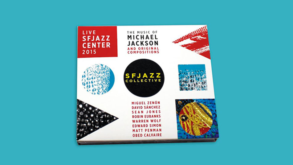
THE ARTWORK BEHIND SFJAZZ COLLECTIVE’S ALBUM
April 14, 2016 | by SFJAZZ

“My attitude is if fashion says it's forbidden, I'm going to do it.”
– Michael Jackson –
The quote sums up graphic designer Amy Woloszyn's attitude towards artistic expression. While the SFJAZZ Collective is on the road playing music from its album The Music of Michael Jackson and Original Compositions, we talked with Woloszyn about her awesome album artwork.
So what inspired your direction for the album artwork?
I remember getting Bad on cassette tape and creating my own choreography to it in my bedroom while putting on the weirdest combination of clothes and accessories. This was a time when Michael Jackson created cinematic videos that we waited anxiously for weeks to see premiere, and everyone would talk about it in school the next day. I was nine years old at the time, and to see an artist span so many forms of expression so boldly inspired my own personal expression. In particular, I’ve always been drawn to Jackson's fashion, and so we decided to go an abstract/fashion direction for the album artwork, which speaks to the sound the Collective brings to its original compositions, its interpretations of Jackson classics, and is also a striking visual that hopefully reaches beyond the band’s normal fan base.
Michael Jackson's wardrobe must be massive. Is there a particular era you drew from?
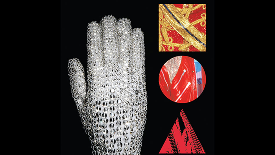
You’re so right. That man pushed the limits from the early 70’s all the way to the finish line. I was always drawn to the early to mid-80’s period when I was discovering Jackson. I noticed the Collective drew a lot from that era (and earlier), so Jackson's iconic jackets and sequins all came to mind. Since I planned to abstract bits of fashion, I picked a sampling of color and adornment that would be recognizable to some, but intriguing to all – the famous glove, the red leather jacket with zippers from "Beat It," the brocade jacket, and of course the sequins! MJ was all about pushing boundaries, so I let myself follow the same tenet, and it got weird. Awesome weird.
You also use geometric shapes - squares, circles and triangles - throughout the album and booklet. Why the shapes?
The simple geometric shapes were natural containers for the abstract fashion samples. I wanted a visual language that could be used throughout the album, but also for posters, t-shirts, bags and digital media. Also: Sun Ra! The music and art of Sun Ra inspires me to push my own personal limits. When one of my SFJAZZ associates first saw the design concept, his eyes lit up and he said with a big smile, “It’s so Sun Ra!” – that made my day. We all agreed that the bold nature of these shapes, filled with sequins and leather, could appeal to all eyes. It was bold of the Collective to interpret Michael Jackson’s music, so we wanted a design that would speak just as loudly to MJ fans, jazz fans and Collective enthusiasts alike.

Did you listen to any specific tracks off the album while working on the artwork? What's your favorite track off the record?
Oh my goodness, DID I EVER! As soon as I got the track listing, I listened to Off the Wall, Thriller, classics from The Jacksons and The Jackson 5 non-stop for a week (no lie). I fully immersed myself - to hear it, see it, and feel it! A majority of tracks the Collective chose were from Off the Wall. There’s something about that time that was so energetic, experimental and carefree. When I finally got the Collective album, “Smooth Criminal” immediately gave me inspiration, as well as the electronic explorations in “This Place Hotel.” My favorite original track is Warren Wolf’s "Gray Skies in Baltimore."

Amy Woloszyn (amymade.com)
